Go Back

Markus Itkonen

Markus Kalevi Itkonen
Born December 17, 1965 Rural Municipality of Helsinki (Vantaa)
Doctor of Arts 2012 (graphic design), Aalto University School of Arts, Design and Architecture
Master of Arts 1991 (art history), University of Helsinki
Graphic designer 1986, Mainosgraafikkojen koulu, Helsinki

Graafinen suunnittelu Markus Itkonen Oy 1987– (owner), core business: book design

Publications:
Kirjaintyypit ja tyyli (‘Type designs and style’). November 2015

Typografian käsikirja (‘Handbook of Typography’) 2003. 4th Ed. 2012

The Unknown Finnish Type Designs 1920–1985. Doctoral dissertation, 2012

Typoteesejä. Tarkan typografian opas. (‘A precise guide to typography’) 1999

Articles from the field of typography and graphic design 1990–

Awards and special achievements
State Award for Public Information (as a member of a working group) 2009

10 honorary diplomas from the Vuoden kirjavaliot (‘Books of the year’) competition (now The Most Beautiful Book of the Year competition)

The Finnish Centre for Easy to Read’s Sesame Prize 2005, for the design of a an easy-to-read art book

Photo: Pertti Salonen
Written by Markus Itkonen (Kaija Hartikainen, ed.)
Translated by Matthew Billington


Do you recognise the type?

Sometimes I am offered other assignments connected to my profession – writing an article, giving a lecture, teaching. I usually accept because their purpose is the same as my work: to visually improve our environment. They all involve rearranging information in a form that is more logical, more interesting, and easier to absorb. They include selecting the most illustrative examples and removing imprecise expressions. There is and will be an inexhaustible demand for that.

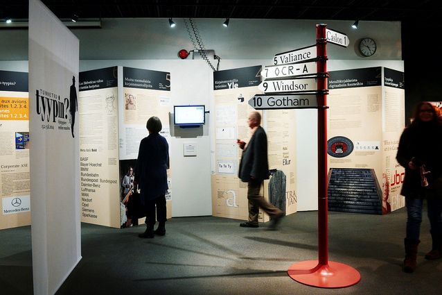
In 2013 the Päivälehti Museum inquired about my interest in designing and producing an exhibition on typography. The Museum was to host the exhibition for six months in 2014, after which it would go on tour in two other museums elsewhere in Finland, the Pukstaavi Museum in Sastamala and the Vapriikki Museum Centre in Tampere. It was a big project and also a first for me. Of course I was interested and I started on it right away.

The exhibition was eventually named “Tunnetko tyypin?” ('Do you recognise the type?'). Its logo is the silhouette of a man carrying a briefcase of fonts; the briefcase is a 90s vintage computer icon for Adobe’s font files folder.

Tunnetko tyypin? ('Do you recognise the type?') logo.

The exhibition featured various perspectives on typefaces and their use. My principle was that everyone should find something familiar and also something new. My cameraman Pekka Luukkola and I also created a short video clip on the creation of a new typeface. The example we used was Saku Heinänen’s “YLE” font family – familiar to every Finn who watches TV.

Displays from Tunnetko tyypin? (‘Do you recognise the type?’) exhibition in the Päivälehti Museum. Photo: Ida Pimenoff.


Go Back